There are tons of blog posts about how to implement Dark Mode on a website. (Not just on Next.js one). While I was researching the subject before adding this feature to my site. I stumbled upon Rob Morieson's article and loved his approach. I decided I will write about the implementation of his technique on my blog with my little tweaks.
This is by no means a comprehensive post (see the links at the end for some awesome in-depth dive into this matter).
I am not going to dwell on explaining what a dark mode is or why you want to add it to your site. Be it a design choice, energy savings consideration,or honoring the user's preference. Let's assume you want it.
While a dark mode toggling may seem simple on the surface, it can be done with just pure CSS. However, if you take into account accessibility and then further if the device or browser supports it,we should aim to display a user's preferred theme on initial load and save their preference should they decide to switch themes.
Since the subtitle of this blog is about Next.js implementation, we first need to talk about how to work around constraints of server side rendering(SSR) and how the Next.js Apps are hydrated.
Let's jump into it
Initial Setup
I will use a boilerplate for the Next.js project created by create-next-app with StyledComponents.
npx create-next-app --example with-styled-components with-styled-components-app
Basic create-next-app provides a global CSS file which is the perfect location to define our CSS variables for dark and light mode. However, the bootstrapped example with styled components does not us with global CSS file, we can leverage styled-components createGlobalStyle function.
Even though we will be using StyledComponents for some styling, for our dark theme challenge we will venture into the land of CSS variables. The reasoning behind this approach will be explained later.
createGlobalStyle
createGlobalStyle is a helper function that will generate a special StyledComponent that handles global styles. Normally, styled-components are automatically scoped to a local CSS class and therefore isolated from other components. In the case of createGlobalStyle, this limitation is removed and things like CSS resets or base stylesheets can be applied.
createGlobalStyle returns a StyledComponent that does not accept children. Place it at the top of your React tree and the global styles will be injected when the component is "rendered".
Create a styles folder in your root directory.
// styles/globalStlyes.js
/* just some initial reset */

import { createGlobalStyle } from "styled-components";

const GlobalStyle = createGlobalStyle`
*,
*:after,
*:before {
  margin: 0;
  padding: 0;
  box-sizing: inherit;
}
html {
  box-sizing: border-box;
}
export default GlobalStyle;
Then import it into _app.js
//pages/_app.js
import GlobalStyle from "../styles/globalStyles";

export default function App({ Component, pageProps }) {
  return (
    <>
      <GlobalStyle />
      <Component {...pageProps} />
    </>
  );
}
Let's add some styles for our darkMode theme.
// styles/globalStyles.js
... body[data-theme="light"] {
  --color-text-primary: #27201a;
  --color-text-secondary: #076963;
  --color-bg-primary: #fff;
  --color-bg-toggle: #1e90ff;
}

body[data-theme="dark"] {
  --color-text-primary: #e3e3e3;
  --color-text-secondary: #ff6b00;
  --color-bg-primary: #15232d;
  --color-bg-toggle: #a9a9a9;
}

body {
  background: var(--color-bg-primary);
  color: var(--color-text-primary);
  font-family: sans-serif;
  transition: background 0.25s ease-in-out;
  line-height: 1.5;
}

h1 {
  color: var(--color-text-secondary);
}
As you might have guessed from the above CSS, we'll be switching themes by applying a data-theme attribute to the <body> tag, rather than the traditional ThemeProvider approach.
I should point out that I have seen the approach applying it to <html> tag instead of the body. Credit to Rob Morieson( which this post is heavily inspired by) and Kent C. Dodds for explaining the difference in using CSS variables to ThemeProvider.
The gist of the CSS approach is the fact if we were to use ThemeProvider offered by StyledComponents which uses useContext hook under the hood, we have to update the styles of every component, and then the browser will have to paint those updates.
But with the CSS Variables approach, we update the styles to a single component (the body),and then the browser paints just those updates. The browser paint should theoretically take the same amount of work on the part of the browser, so the only difference is how much work we're making the browser do to have React re-render all our components and get emotion to update the styles of every component.
Let us tackle building our toggle component. We'll create a new file called themeToggle.js and place it in the components directory.
//components/themeToggle.js
import styled from "styled-components";
import IconMoon from "./icons/moon";
import IconSun from "./icons/sun";

const ToggleButton = styled.button`
  height: 50px;
  width: 50px;
  border-radius: 50%;
  padding: 8px;
  border: 0;
  display: flex;
  align-items: center;
  justify-content: center;
  cursor: pointer;
  background: var(--color-bg-toggle);
  transition: background 0.25s ease-in-out;
`;

const ThemeToggle = () => {
  return (
    <ToggleButton type="button">
      <IconMoon />
      {/* <IconSun /> */}
    </ToggleButton>
  );
};

export default ThemeToggle;
I am using a couple of custom SVG Icons as our toggle theme indicators.
Icon Sun is commented out at the moment. Displaying it will be done later on by click event.
After removing a bootstrapped content from the example template and importing our theme toggle button in index.js. This is how our index.js file looks like.
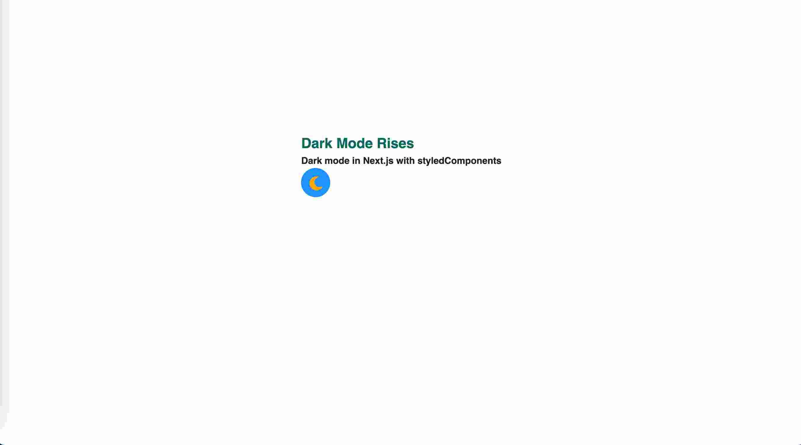
//index.js
import styled from "styled-components";
import ThemeToggle from "../components/themeToggle";

const Container = styled.main`
  display: flex;
  justify-content: center;
  padding-top: 30vh;
`;

export default function Home() {
  return (
    <Container>
      <section>
        <h1>Dark Mode Rises</h1>
        <h4>Dark mode in Next.js with styledComponents</h4>
        <ThemeToggle />
      </section>
    </Container>
  );
}
Basic static part of this task should render this :

Interactivity
With the initial and static stuff out of the way it's time to add the logic. We'll start with React's useState hook so we can store and update the active theme.
// components/themeToggle.js

import { useState } from "react";

//...

const ThemeToggle = () => {
  const [activeTheme, setActiveTheme] = useState("light");
  const inactiveTheme = activeTheme === "light" ? "dark" : "light";
  //...
};
Our default theme is set to "light" - we'll focus more on this later which will include consideration for a user's prefers-color-scheme settings, along with some tweaks for persisting preferences on refresh using localStorage.
Let's also add an functionality with onClick event to the toggle button that updates our state accordingly.
// components/themeToggle.js

//...

<ToggleButton
    type="button"
    onClick={() => setActiveTheme(inactiveTheme)}
>
Next we'll leverage React's useEffect hook to set the data-theme attribute on the <body> tag. Adding [activeTheme] as a dependency in the dependency array means it will run anytime the active theme changes.
// components/themeToggle.js

import { useState, useEffect } from "react";

//...

const ThemeToggle = () => {
    // ...
  useEffect(() => {
    document.body.dataset.theme = activeTheme;
  }, [activeTheme]);
Finally, we need to use activeTheme to conditionally render our SVG Icons theme indicators
const ThemeToggle = () => {
  const [activeTheme, setActiveTheme] = useState("light");
  const inactiveTheme = activeTheme === "light" ? "dark" : "light";

  useEffect(() => {
    document.body.dataset.theme = activeTheme;
  }, [activeTheme]);
  return (
    <ToggleButton type="button" onClick={() => setActiveTheme(inactiveTheme)}>
      {activeTheme === "dark" ? <IconMoon /> : <IconSun />}
    </ToggleButton>
  );
};
We should end up with something like this.
Accessibility
Accessibility is a topic of enormous dimension. For a coding newbie as myself, it is till something I need to learn a lot about.
There are awesome in depth blog posts and tutorials on the matter. For simplicity of this blog....
- Do not omit focus events and accessibility associated with it for screen readers.
- Use aria-labels
//components/toggleTheme.js

//...
const ToggleButton = styled.button`
//...

  transition: background 0.25s ease-in-out, box-shadow 0.25s ease-in-out;
  &:focus {
    outline-offset: 8px;
  }
  &:focus:not(:focus-visible) {
    outline: none;
  }
  &:hover {
    box-shadow: 0 0 5px 2px var(--color-bg-toggle);
  }
`;
<ToggleButton
      type="button"
      aria-label={`Change to ${inactiveTheme} mode`}
      title={`Change to ${inactiveTheme} mode`}
      onClick={() => setActiveTheme(inactiveTheme)}
    >
Persisting Theme Preferences
If you select 'dark' mode then hit refresh, you'll notice that the website reverts to 'light' mode. This is an easy fix thanks to the localStorage property.
// components/themeToggle.js

//...

const ThemeToggle = () => {

    //...

    useEffect(() => {
    const savedTheme = window.localStorage.getItem("theme");
    savedTheme && setActiveTheme(savedTheme);
  }, []);

  useEffect(() => {
    document.body.dataset.theme = activeTheme;
    window.localStorage.setItem("theme", activeTheme);
  }, [activeTheme]);
Above we've added a new useEffect hook that only runs on mount / unmount to check if a local storage item exists with the name 'theme'. If it does, then we set the active theme accordingly. We also update local storage any time the user toggles themes.
This is great, but if you switch to 'dark' mode and hit refresh, you might notice that we get a flash of the 'light' theme before the useEffect kicks in. This is the dreaded flicker we would like to eliminate. This happens due to Next's 'hydration' process, which you can read more about at nextjs.org.
Josh W. Comeau wrote an awesome blog post on dealing with this 'flicker moment' over on his blog. I have seen it called all sorts (FART). A Solution from Rob Morieson which moves from StyledComponents to CSS variable land will be somewhat more straightforward as we'll be utilising CSS variables and data attributes on the <body> tag to provide theme values, but there are still a few steps involved, so no judgment if you want to call it job done at this point. Ok, maybe some judgment... that little flick on refresh doesn't look great.
Colour Scheme Preferences and Dreaded Flash/Flick
We need to modify our custom _document.js file so we can inject a <script> tag into the <body>. This will allow us to set the theme before Next has a chance to 'hydrate' the markup.
Your local server requires restarting before Next will recognise the custom 'document'. Check the Next.js docs to read more about customising the 'document' page.
Let's break down our next approach into few steps:
- Checks to see if a user has already selected a theme by interacting with the toggle.
- If not, then we'll check if their browser / device has a preferred colour scheme set.
- Failing either of these checks we will default to our default 'light' mode.
- Finally, we save the result of the above to the data-theme attribute on the
<body>tag
//pages/_document.js
import Document, { Html, Head, Main, NextScript } from "next/document";
import { ServerStyleSheet } from "styled-components";

export default class MyDocument extends Document {
  static async getInitialProps(ctx) {
    const sheet = new ServerStyleSheet();
    const originalRenderPage = ctx.renderPage;

    try {
      ctx.renderPage = () =>
        originalRenderPage({
          enhanceApp: (App) => (props) =>
            sheet.collectStyles(<App {...props} />),
        });

      const initialProps = await Document.getInitialProps(ctx);
      return {
        ...initialProps,
        styles: (
          <>
            {initialProps.styles}
            {sheet.getStyleElement()}
          </>
        ),
      };
    } finally {
      sheet.seal();
    }
  }
  render() {
    const setInitialTheme = `
    function getUserPreference() {
      if(window.localStorage.getItem('theme')) {
        return window.localStorage.getItem('theme')
      }
      return window.matchMedia('(prefers-color-scheme: light)').matches
                ? 'light'
                : 'dark'
    }
    document.body.dataset.theme = getUserPreference();
  `;
    return (
      <Html lang="en">
        <Head />
        <body>
          <script dangerouslySetInnerHTML={{ __html: setInitialTheme }} />
          <Main />
          <NextScript />
        </body>
      </Html>
    );
  }
}
To protect against XSS attacks, React DOM escapes any raw JavaScript before rendering. We are therefore required to embed our JavaScript using the dangerouslySetInnerHTML attribute. In this instance it is safe as we have full control over the JavaScript being injected.
Now that we're setting the data-theme attribute as a first order of call, we can go back to our ToggleTheme component and refactor how it retrieves its default value.
We no longer require the initial useEffect; instead we can now simply initialise our activeTheme state with the value of the data-theme attribute.
// components/themeToggle.js

//...

const ThemeToggle = () => {
  const [activeTheme, setActiveTheme] = useState(document.body.dataset.theme);
  const inactiveTheme = activeTheme === "light" ? "dark" : "light";

    useEffect(() => {
    document.body.dataset.theme = activeTheme;
    window.localStorage.setItem("theme", activeTheme);
  }, [activeTheme]);

  //...
When you look at your page now you will get an Error saying that document is not defined.
This is because Next is attempting to render the ToggleTheme component on the server, which has no reference to document - it's only available to the browser.
Thankfully Next have considered this and allows certain components to be dynamically imported at the browser-level, without SSR.
Let's update the way we import our ThemeToggle component into our index.js page to the 'dynamic' method, with ssr set to false.
//pages/index.js
/*!! Do not forget to import dynamic */
import dynamic from "next/dynamic";
import styled from "styled-components";
const ThemeToggle = dynamic(() => import("../components/themeToggle"), {
  ssr: false,
});
That's it! We now have a dark mode toggle that adheres to some accessibility best practices, persists on reload,and takes a user's preferred colour scheme into consideration. It also doesn't suffer from the dreaded 'flash' of incorrect colours on the initial load.
I have to firstly and mostly give credit to Rob Morieson and his article on this matter. I just added few tweaks. Check it out here.
Just a few side notes :
Designing a color scheme is a challenge on its own. Right Contrast, right color palette... I am still learning.
Resources
- https://css-tricks.com/a-complete-guide-to-dark-mode-on-the-web/
- https://css-tricks.com/flash-of-inaccurate-color-theme-fart/
- https://mxb.dev/blog/color-theme-switcher/
- https://www.joshwcomeau.com/react/dark-mode/
- https://web.dev/prefers-color-scheme/
- https://electricanimals.com/articles/next-js-dark-mode-toggle/